SHARE
ISSUES
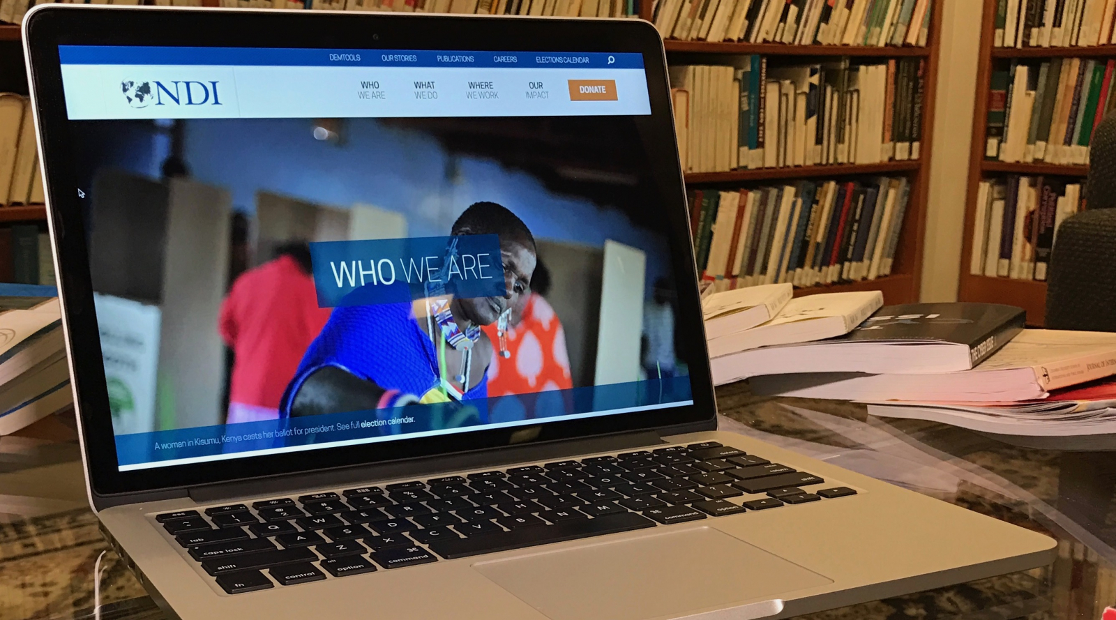
NDI is proud to launch a completely redesigned website. The new website, unveiled to the public on January 12, preserves the best features of the old website, while updating underlying technology and refreshing the design to improve usability and meet modern web standards. The new site features a more visually-engaging and mobile-friendly design, deep social media integration and a re-structured information architecture that will make NDI’s work more accessible than ever before. With this more visual platform, NDI can more effectively highlight our work, showcase the efforts of our partners, and give you a better understanding about Who We Are and What We Do.
NDI has a deep pool of practical expertise on democracy and democratic institutions in the world. The new website provides a directory of our leading experts and integrates their Twitter accounts throughout the site. This deep social media integration, which complements NDI’s DemWorks blog, reflects our dedication to transparency, and fostering open dialogue on democracy and democracy support programming.
With this more visual platform, NDI can more effectively highlight our work, showcase the efforts of our partners, and give you a better understanding about Who We Are and What We Do.
Recognizing that Internet users are increasingly accessing NDI’s website on mobile devices, the new website features a tactile, responsive interface with swipe controls. The “responsive” website adapts to the size of the screen, allowing visitors on mobile phones to push, swipe and tap to navigate just as easily on a smartphone as on a desktop computer.
A dynamic database brings NDI’s vast Publications Library to life, allowing you to search and filter thousands of resources and publications without needing to refresh the page. Resources are color-coded by resource type in “grid view.” Or if you would like to peruse the results in greater detail you can switch to “list view.”
These same dynamic filters make one of NDI.org’s most popular features -- the Global Elections Calendar -- more useful than ever. You can browse upcoming and past elections from around the world or filter down to a specific year, region, country or election type. The Calendar also details NDI activity in elections and lists relevant NDI statements and reports.
One of the biggest changes evident in the new website is a tiered information architecture. The new site was designed with “user stories” or a visitor’s journey through the website in mind. On the homepage, visitors are presented with the most general and accessible content, but as they drill down deeper into the site they find more complex, detailed and specific content that is relevant to their unique regional or topical interests.
The design of the new website was informed by an analysis of the websites of 20 leading democracy, governance and human-rights organizations. One notable shortcoming revealed by this analysis was that a large percentage of the written content on NDI’s old website required a college degree to comprehend. Through readability testing, NDI worked to overhaul the site’s written content to make complex topics easier to understand. Walls of text and small, low-resolution images have been replaced by short, comprehensible sentences and beautiful full-width photographs that tell NDI’s story in vivid color.
Secretary Madeleine Albright, the chairman of NDI’s board of directors, famously said that democracy is not an event, it’s a process. Just like democracy, the website redesign is work in progress. We hope you will help us continue to improve our website by submitting bug reports or feature requests through this form.
NDI appreciates digital strategy firm Trellon for their hard work, making this project possible.


